This post is part of a series we wrote after wrapping up the IRIS project.
Design notes part 2: Physical impacting Digital
Even before the lockdown measures, the design of the apartment was done digitally to help with rapid prototyping. The designs were then translated to physical form either through model-building techniques or 3D printing. Digitally modelling the physical box meant we could quickly estimate the proportions of the physical box, without having to fully build it first.
The box was built in such a way that all the electronics could be fitted inside the box’ cavities without laying a finger on any material. Besides being a really rapid way of prototyping and conducting ‘form studies’ it also is a great way to save material otherwise spent on making different iterations of the box in real life. Sidenote: it’s a fun fact that prototyping in the physical realm often saves time when building a digital solution or game. In this case it were the digital tools that provided us with quick ways to test our assumptions and prototype ideas before spending time on the physical building process.
The Apartment
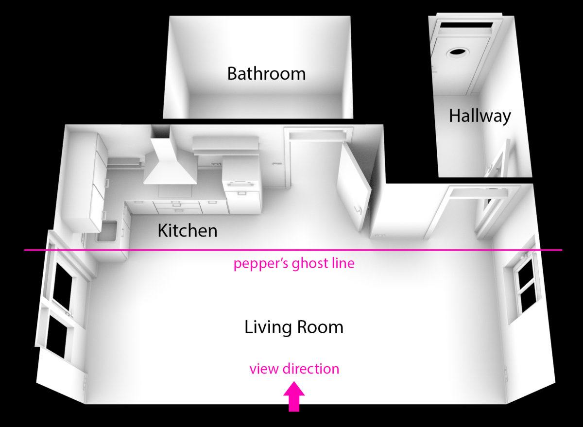
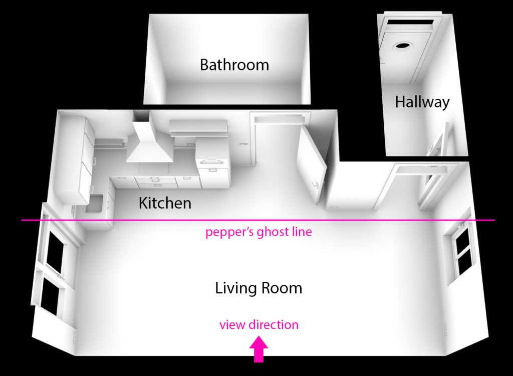
The setup was built ‘peep-box‘ style in order to effectively use the Pepper’s Ghost effect. In a Peppers Ghost setup, the character is best able to move along the surface of the screen: along a single 2-dimensional plane parallel to the peppers ghost’ horizontal axis. We can get some some faking of depth into the third dimension (the Z axis) because of everything except the digital character being in 3 dimensions. When scaling the digital content up or down, we are generating the illusion of movement on the Z axis and thus giving ourselves some play area within the given constraints of the physical box. While doing this, you will still have to take into account the occlusion by objects around the screen. As this depends on the viewing angle of the player it takes some trial and error to make it work effectively.
Because of the peep box style setup we needed to place all elements and rooms of the apartment next to each other, which you wouldn’t do when building fully digital. For the same reason we chose to go for a single-room apartment, with the bathroom and the hallway the only other rooms. Those rooms are only used by the character in certain circumstances, most of the action is located in the living room. This meant that the apartment layout is not realistic, but actually almost 1-dimensional.
Controls and UI
A project that would be fully digital would have a separate controller, either a mouse or gamepad. As our box was designed to be fully digital as well as mixed-reality, we chose to have the same button interface in the digital version as in the physical version.
In this way we tried to mimic the physical box experience as much as possible, so the frame/interface of the physical box & its buttons where literally translated to the digital version. Even if you as a player are using a mouse controller, you would still push virtual, ‘physical‘ buttons. This would still (indirectly) give the feel of really interacting with a miniature world in a doll-like house setup.
When testing the digital overlays like UI in the physical box, it quickly became apparent that for the Pepper’s Ghost effect to work properly, certain aspects needed to be exaggerated compared to a fully digital version. For visibility, the icons that denote the needs of the character were made much larger and with thicker lines than we did later in the digital version.

Character design
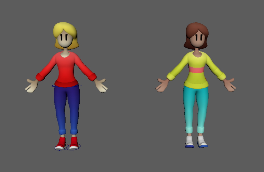
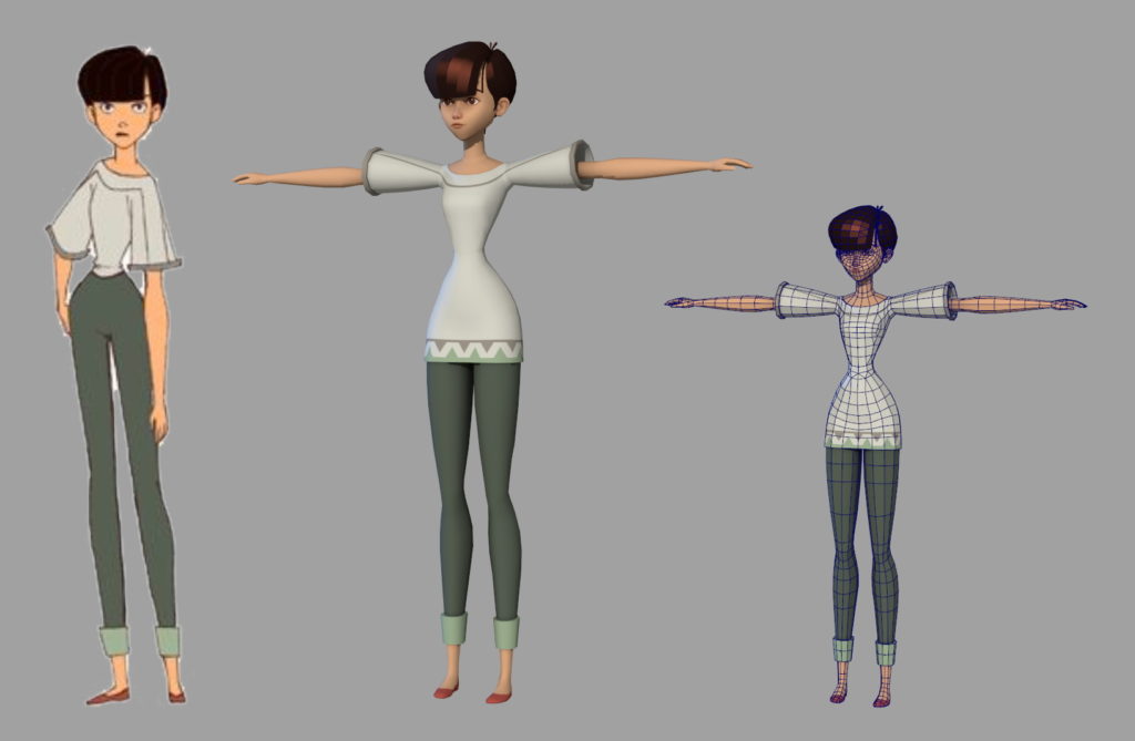
In the digital version everything had to become more subtle that way. While creating the digital version from the basis of the mixed-reality setup, we discovered that the character style we had developed for overlaying the physical environment did not match the fully digital environment style at all.
On one hand, this is because of the fact that the 3d model of the character we used for the Pepper’s Ghost effect was very basic, based on a crude block-out. This was done because this resulted in the best visual readability in the physical box.
On the other hand, as in the mixed reality setup the character is small and transparent, the expressions and movements had to be exaggerated to be clearly readable to the player. When transitioning to the fully digital environment, these exaggerations came across as too cartoony and overacted. We found that people could no longer connect with the character on an emotional level any more as well.
At this point we could have put a lot of time and effort into adjusting the environment and the assets to match the cartoony style of the character. Instead, decided to completely replace the character with a more emotionally immersive one that would also fit the modelled environment. That second route to us was the obvious choice, as it would take way less time and generate a relatable and attractive character that would fit the needs of a digital version. In the end we used a concept model that we developed into the 3d model.
Part 1: Mixed Realities during Lockdown Measures
Part 2: Design 1: digital impacting physical
Back to the IRIS page
