Categories
Products R&D Theoretical Models

Critical notes on design thinking: HKU model

A brief introduction
• empathise

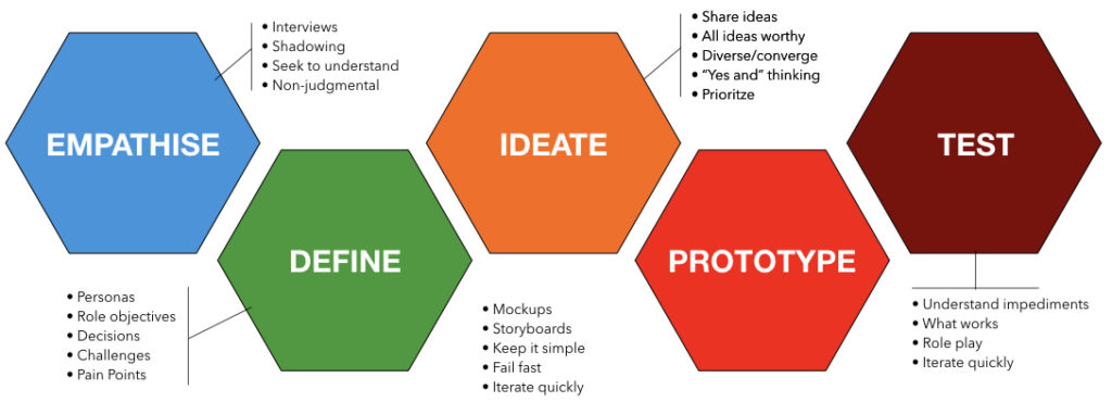
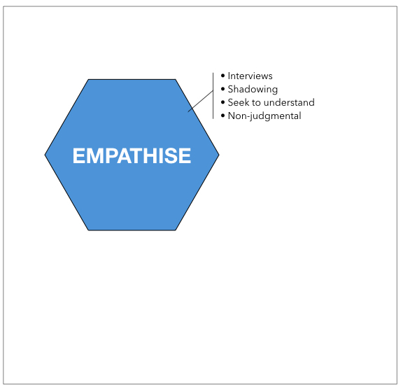
The design process starts with a series of activities called Empathise. This means the design team engages actively with their stakeholders or end users and tries to get a deep understanding of their position. Through interviews, or observations (shadowing), and through empathic listening (not judging!) the team learns about the experiences, the emotions, the problems and challenges the stakeholders encounter in the design problem you are tackling.

• define

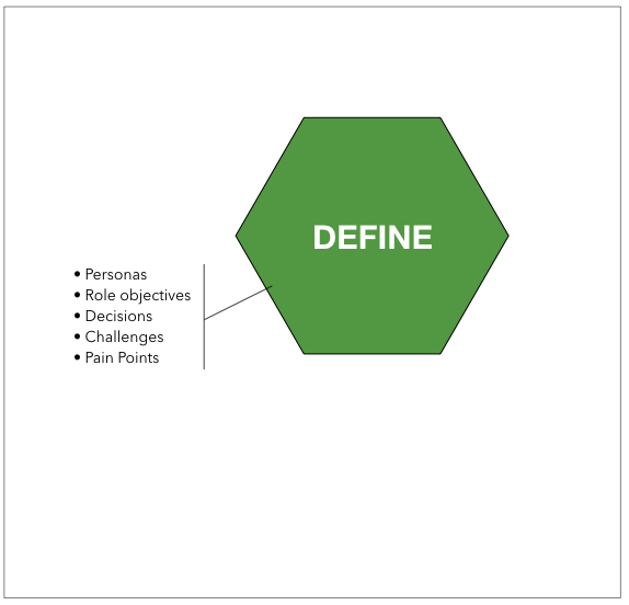
The next step is make sense of all the data, impressions and observations, and reframe the design problem you are addressing. In most cases these data redefine the problem you were starting out with, or the problem your client wants to address. In this phase you will also define the scope of the project, and to identify the key ‘Pain points’ your users experience that your solution needs to address or preferably take away.
• ideate

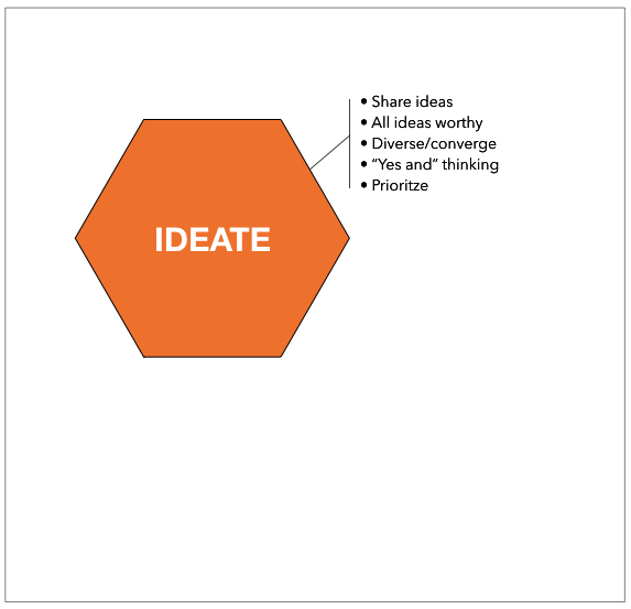
In this phase, with the boundaries defined for your project, you will start to use your creativity. Alone or in your team, you will generate and share ideas on a possible solution. In the beginning of this phase, all suggestions are valid; don’t be too judgemental. The process starts with diverting into the subject, exploring many solution paths. After the exploration phase, the team needs to switch gears towards conversion, making choices and finding and deciding on the most effective or possibly most productive solution path.

• prototype

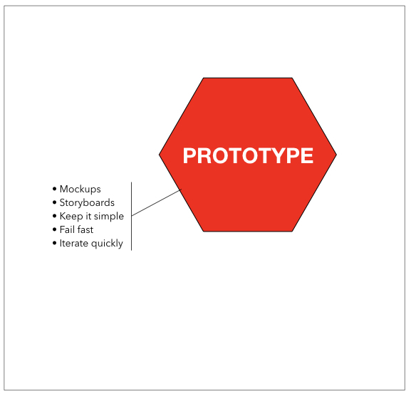
A core aspect of design thinking is to start creating the simplest, cheapest, first draft of the solution. These will be rough sketches, storyboards, wire frames, paper prototypes… The function of the prototype is to engage with your end users with these first drafts to learn immediately from your end users whether you stay close to their demands, wishes and needs.

Fail fast means that you do not waste resources on creating a polished solution without verifying the appropriateness of your solution for your stakeholders.

Most starting designers make the mistake of working too long on their first prototype, possibly adding value to an idea that still contains mistakes or assumptions.

An explanation for this is the feeling designers might have that they show something to their end users that is not ‘finished’ or ‘beautiful’ or ‘polished’.
Test

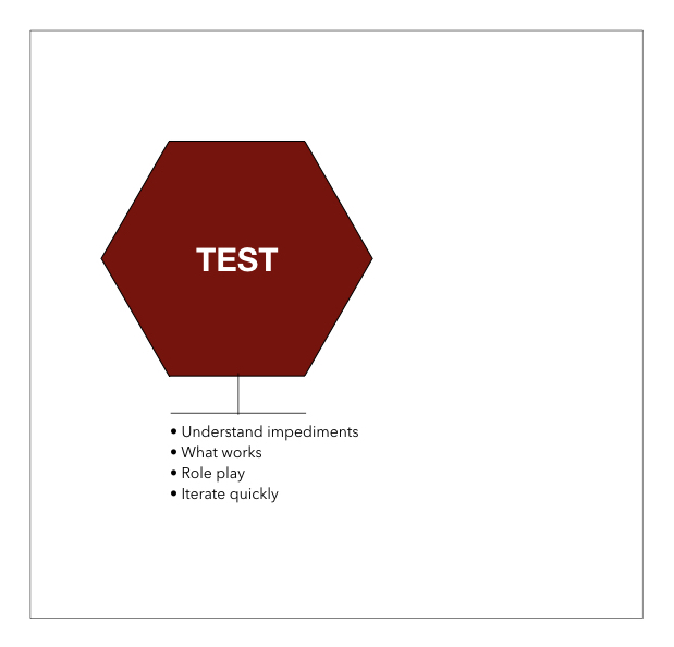
The function of testing is to let your end users be the judge of the quality of your idea. Your users are always right. Initially your concept will probably ‘not work’. Some elements are good, other things are broken.

The most difficult bit in testing is to find our where your design is ‘broken’ and what you need to do to fix it.

You will probably also get feedback that is not relevant to the phase of the design you are in. If people comment on the look and feel of a rough first prototype, those comments should be ‘ignored’. Do not get defensive explaining this to your users. Just receive the feedback and put it aside for now.

For each test you should know up-forehand what it is you want to test. You should do as little explanation as possible. Your design should eventually be able to explain itself. Your most important role is to observe and take notes. If possible and allowed, you might record visuals or audio to reflect later on the test. You might easily miss important cues; body language; individual behaviour; social interactions etc.

Although design thinking has many merits in being used in this fashion, it has some repercussions. The most important downside of this model is the fact it ends with a prototype.

Many innovation trajectories fail after the prototype phase. There are many possible causes for this.

  • 1. funding problems; there was money for the prototype but not for production
  • 2. implementation; No enough time, training, materials to learn the end users to implement the solution
  • 3. the ‘stack’ problem; the new solution is introduced on top of the existing practise; creating work overload. (Golden rule; if you introduce something new, what existing bit/procedure/tool do you take away?)
  • 4. Necessary adaptations on the product/service based on real time lessons learned in the implementation

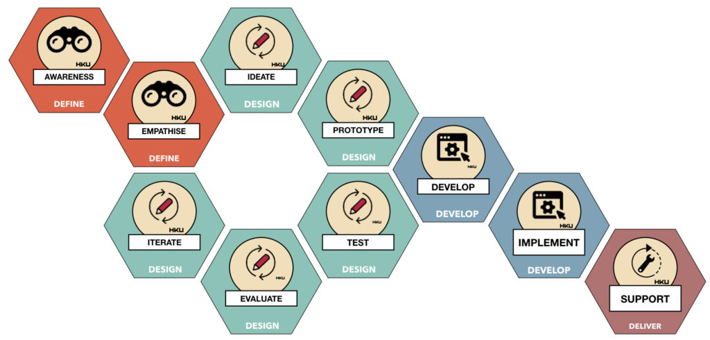
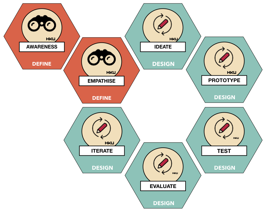
This list can go on and on. Therefore, as HKU we have developed an alternative model, covering the Stanford model but expanding on this.

The HKU model on innovation builds on the Stanford model of Design Thinking, but expanding the model beyond the prototype stage.
The model tries to capture the entire trajectory from idea to full usage addressing the main steps.
• awareness

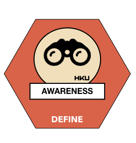
If you are doing a project with a client, there is significant chance they will not be as well versed in design thinking as a methodology as you.

Developing a shared language and thorough understanding with your client is really important at the start of a project. This phase is called awareness because it is also the time to ask some ‘difficult’ questions to your client to avoid future problems. Awareness is about looking ahead into the future of the project and identifying critical issues that need to be addressed early on.

Iterative design process

The next phase is a number of steps we already addressed when explaining the Stanford model.

We add a rule of thumb to this model in terms of the number of iterations. For many projects, four iterations (including solid testing) will put you on firm ground to eliminate the most critical break points in your solution. Less is risky, but doing more iterations does not always add value to the insights you can gather through iterations.

More iterations does not always mean better quality. Whenever a test does not yield new major insights, you can assume your design is optimised as best as it can given the resources available…
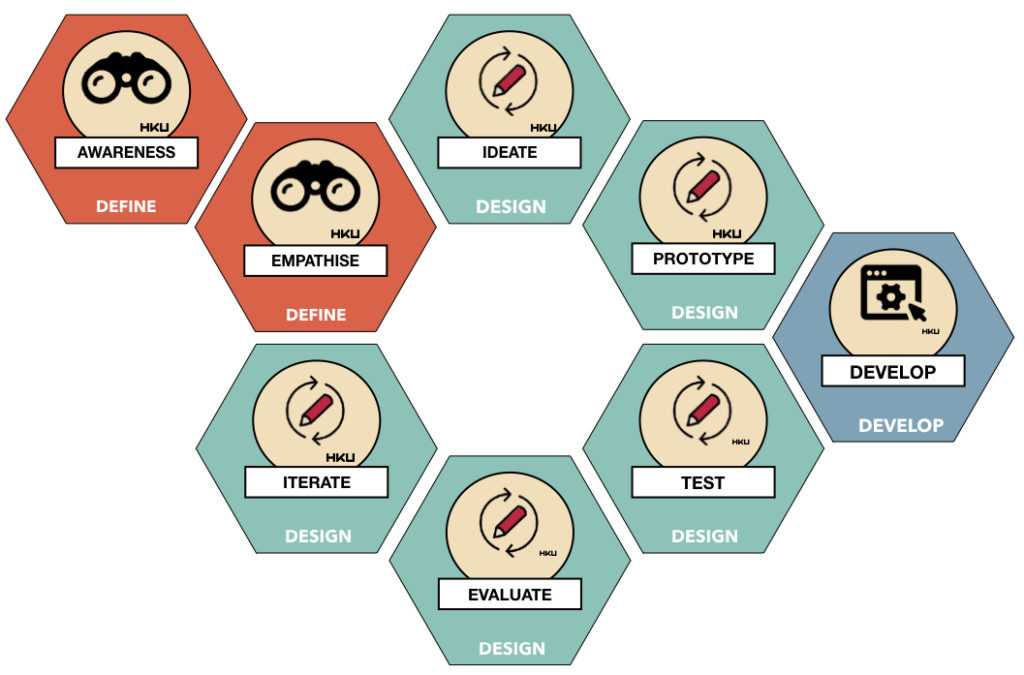
• develop

The develop phase means turning a prototype into a product or service. If it is a technical product it often means the entry of a new project partner on the scene.

The nature of your project is really important for the next steps of the model. A technical prototype is often not suitable to scale up into development. If it is code based, the code was not build for stability but to explore functionality or design. So technical prototypes should preferably be rebuild to cater for new demands in the final phases; security, stability, scalability, hosting in an organisation and a multitude of other requirements. The costs from prototype to product in these situations is x10 or more!

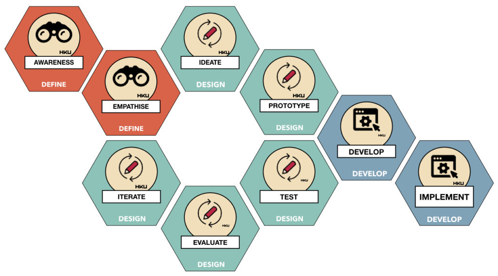
• implement

Once the development phase is ready and the final product or service is ready to roll, we step into the implementation phase. Assuming you have groups of end users that will work with your solution, these users will have to find a space in their private or professional lives to fit in their work- or life flow.

A common mistake is a lack of time or resources allocated to this phase by an organisation. Often people need proper instruction, training, practise, trial runs to be able to use the solution as intended.

Another pitfall is to limit implementation to the ‘launch’ of the solution.
• support

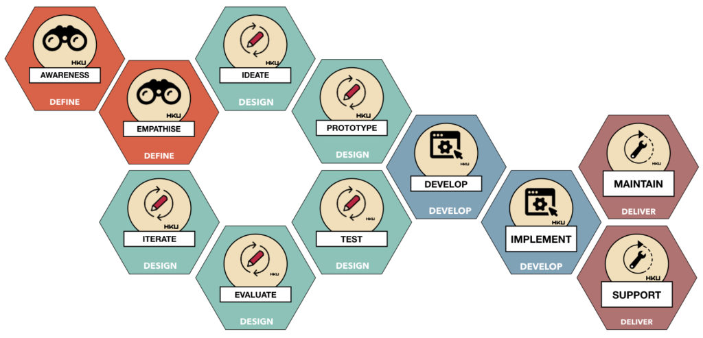
Successful implementation depends on support. Whether this is a helpdesk, a manual, a supportive website, instruction sessions… users can get lost.

Support is often undervalued in implementation; poor documentation of scaffolding material can ruin an excellent innovation.

• maintain

Modern interventions are seldomly finished. Especially digital products need constant care due to changes and progression of the underlying operating systems

This means a longer term commitment to a product or service beyond its completion, including games, apps and other solutions.
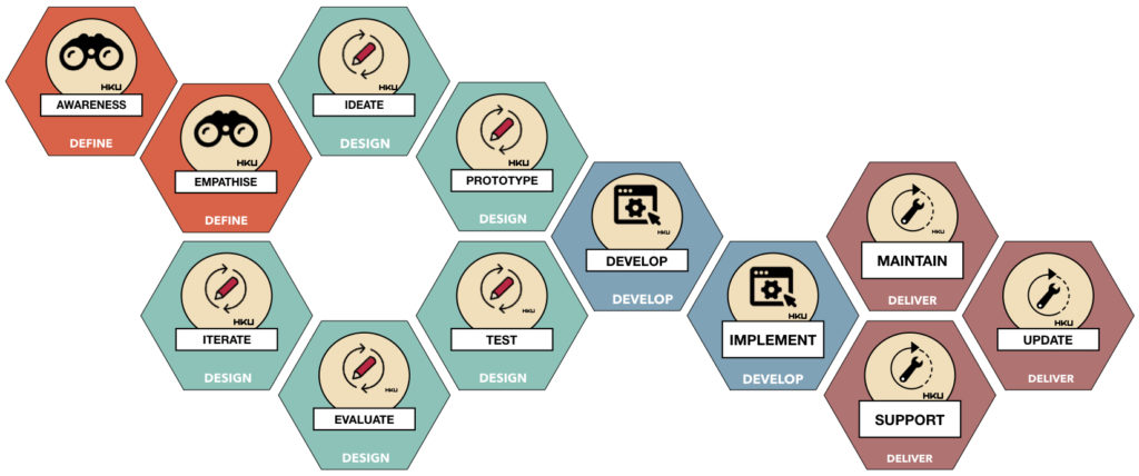
• update

In its usage your solution might bring to light new demands, changed demand, missing features…. your design is not finished upon delivery.

When you look for example at apps on your smartphone, take note how many apps need regular updates (bug fixes being a notorious category).

Updating is something you need to take into consideration when writing your innovation plan. 99% chance it will come to light after initial deployment.

• upscale

Your solution might be so succesful it inspires others. It might spread to other organisations, other sectors, other user groups, other countries even… did you prepare for this possibility?

Upscaling means the scalability of your solution will now seriously be tested. Is it modular in design? Can language be changed? Hopefully, the right design decisions have been made to cater for this future.

These questions should have been asked and answered in the first step of the process!
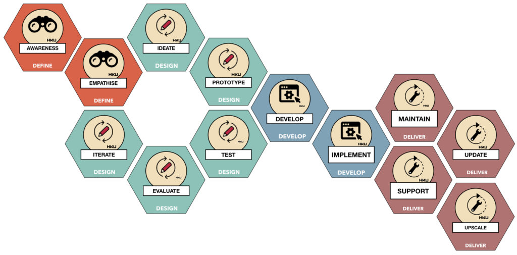
But remember! Back to Front

Given all these steps for successful innovation, it is vital to discuss all these steps in the very first step of the process.

This includes asking nasty questions toi all stakeholders.

One example: many innovation trajectories will start with ‘a pilot’ or ‘a prototype’. Ask to all involved; where will the money be for the remainder of the trajectory (the blue and dark red tiles
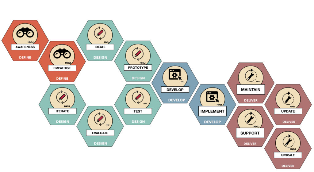
The Awareness phase is often forgotten, following the ‘we will think about it when we get there’, the reason why a disturbing high percentage of innovation projects, apps, platforms and other solutions fail to reach the market and lead tot sustainable innovation.


Categories
Products R&D Theoretical Models

Seven design rules to create good playful props

In the design of analoge games we have discovered that the design of the play objects used in the game can have both positive and a negative impact on the play experience.

Whether it is the board of a game, the cards, or special board pieces… all these objects benefit from special attention and production value. Flimsy, thin, cheap objects detract from the value of the game experience. This includes objects used to build escape rooms. We call all these objects “props”, in analogy to the objects used in the movie industry or in theatre. In games these are often ‘miniature’ versions of real life objects (a house in Catan, a hotel in Monopoly). 

After doing lots of experiments, and observing and analysing many games made by our students, we have identified a number of design patterns.  

Here is the take-away: as a rule of thumb, we believe that a good prop should contain at least three of the design qualities named hereafter to add value to the play experience.

1. Suggestion of Substance

Props used in play benefit from proportional weight. If the prop is a miniature, its weight should meaningfully relate to its real world counterpart. A play sword improves by making it heavy. Poker chips are relatively heavy, but cheap plastic fiches do not have the same affordance in comparison while playing. People love fiddling and toying with pokerchips. 

An object that mimics being made of wood looses quality if it is made of light weight plastic. The design rule of thumb is: the prop should have the weight that is suggested by the shape, form or material it mimics to be made of.

In many instances it is preferable to use the actual material. A wooden box made of wood is better than a cardboard box made to look like wood. But weight is more important than material. So you can get away with a cardboard box made to look like wood weighing approximately what a wooden box would have weighted…

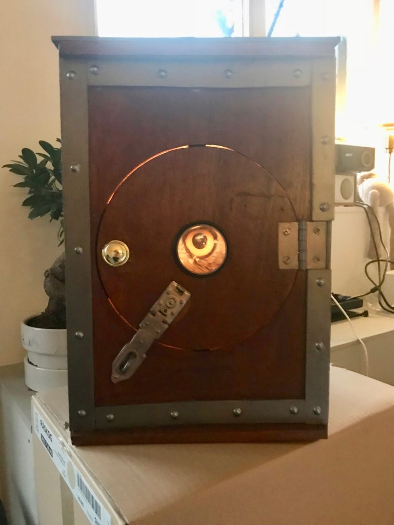
a wooden box with a magic eye

2. Suggestion of Transparency (of material and function)

A prop increases the value of play if it is transparent / explicit in the material of which it is supposed to be made. The same applies to the function it is supposed to have. Make metal look like metal; use screws or rivets to show how it is supposedly assembled. Use hinges to show if a lid can be opened. Not everything has to be functional though (it is a prop!), but it should suppress the disbelief that is does not or cannot function. Excellent examples can be found in cosplay based on Steampunk.

3. Suggestion of Functionality suppressing disbelief

 A prop that is suggesting some complex functionality should offer at least part of that functionality to suppress the disbelief that it does not function at all. 

 If you intent to present a technology that has no real or existing counterpart, try to suggest a ‘narrative logic’ to the technology in its visual form. 

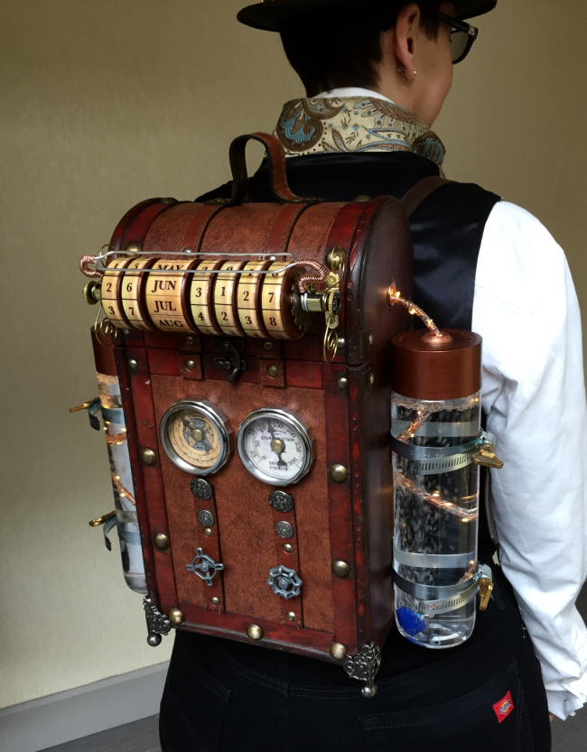
The example ‘backpack’ on the left pretends to facilitate ‘time travel’ and the visual elements (like the scroll-like interface) suggests this function (you can ‘enter’ date and year of your destination) while being mysterious in how it exactly would work. (We know, it doesn’t. It’s Play).

A safe, to store secret elements, should be able to open and close; electronic equipment should suggest its function by an on/off switch and preferably a led indicating on and off.

A mini theatre might have working lights. You get it.

If you intent to present a technology that has no real or existing counterpart, try to suggest a ‘narrative logic’ to the technology in its visual form. 

The example ‘backpack’ on the left pretends to facilitate ‘time travel’ and the visual elements (like the scroll-like interface) suggests this function (you can ‘enter’ date and year of your destination) while being mysterious in how it exactly would work. (We know, it doesn’t. It’s Play).

A safe, to store secret elements, should be able to open and close; electronic equipment should suggest its function by an on/off switch and preferably a led indicating on and off.

A mini theatre might have working lights. You get it.

4. Suggestion of History

Almost all props in movies are weathered. This means they are deliberately ‘aged’ using various painting and abusive techniques (literally hitting a prop with a hammer) to suggest wear and tare and avoid a ‘just left the showroom’ kind of look.

Many parents have made ‘parchment’ using tea to stain blanc paper. Especially if you create games that suggest history or contain vintage objects, weathering is quintessential to suggest age and heritage. Master prop makers (Adam Savage) go as far as creating a narrative in their head of the life span of the object while ageing the prop to come up with convincing wear and tare on the object. If you want to go pro, go deep 😉

5. Suggestion of Personification of ownership

Another interesting way of adding value, which is an extension of rule 4, is personifying the prop relating it to a famous person or character. A vintage guitar is one thing, but the same vintage guitar ‘played by Paul McCarthy in 1967’ multiplies its value by a tremendous amount. This is the magic in the collectors world (including certificates of authenticity) which means that even the most mundane objects become collectibles.

This works in play as well.

6. Suggestion of Essential Qualities

If you are dealing with a miniature prop, you can add value by giving your prop one to three working qualities it shares with its real world counterpart. The rule of thumb to select these is: if you would ask a six year old child to name the three most characteristic features or functions of the objects, those could be the ones to go for.

A simple example is a good quality vintage toy car. You might be able to steer the little fellow; open its doors, and open the hood and the trunk. If you look up Schuco collectible toy cars, you’ll see what we mean. I built a wooden toy theater to be used in play therapy, with full working theatre lights and it definitely added value to its therapeutic use.

7. Suggestion of Magic 

These prop quality rules also apply to the mundane play components we use our analog game. Pawn, cards, the game board. Time and effort spend on these pays off in the play experience. There is something oddly satisfying in playing dominoes with original heavy pieces in Egypt (we did). In playing chess on a vintage heavy board with heavy hand carved pieces; in playing tric trac on a handmade inlaid wooden box. It might sound silly, but your player will add it up to the play experience embedded in your rule based design. Its like the placebo effect: why not use it if it’s there… 

Willem-Jan Renger

Evert Hoogendoorn

Categories
Exploration Nieuws R&D

The Kleinian Group experiment

This isn’t the title of an upcoming Dan Brown novel, it’s an exploration of a fractal type that’s also referred to as the Apollonian limit set.

“A disco for parasites” is a real-time raymarched Kleinian group fractal.

Fractals have long been the domain of mathematicians and computer graphics programmers, however with the recent advances in procedural content generation and real-time image rendering techniques such as raymarching, their recursive and often mesmerising quality would seemingly lend them well for making art and video game content. For this experiment I chose the Apollonian gasket, a limit set of the Kleinian group that in my opinion produces quite natural looking patterns. And here we already stumble upon the first barrier one often encounters when looking into how fractals work: the theory is jargon ridden. With this article I aim to provide an accessible entry point to understanding the Apollonian gasket which afforded me to create “a disco for parasites”.

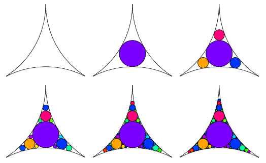
The fractal-like pattern called the Apollonian gasket used to create “a disco for parasites” is generated by recursively applying Möbius transformations to a set of circles located in some particular positions. The initial configuration of circles is bounded by some sort of shape and must satisfy the condition that they’re externally tangential, in other words their edges touch. Every subsequent iteration fits circles inside the negative space left by the previous iteration.

The curvature of a circle is equal to the reciprocal of its radius (1 / r) and from this follows that the larger the circle is, the smaller the curvature (a curvature of 0 would look like a straight line).

float ApollonianGasket(vec3 p)
{
    float scale = 1.0;

    for (int i = 0; i < ITERATIONS; i++)
    {        
        p = 2.0 * clamp(p, -vec3(1.0), vec3(1.0)) - p;

        float sqrRadius = dot(p, p);

        p /= sqrRadius;
        scale /= sqrRadius;
    }

    return 0.2 * abs(p.y) / scale;
}

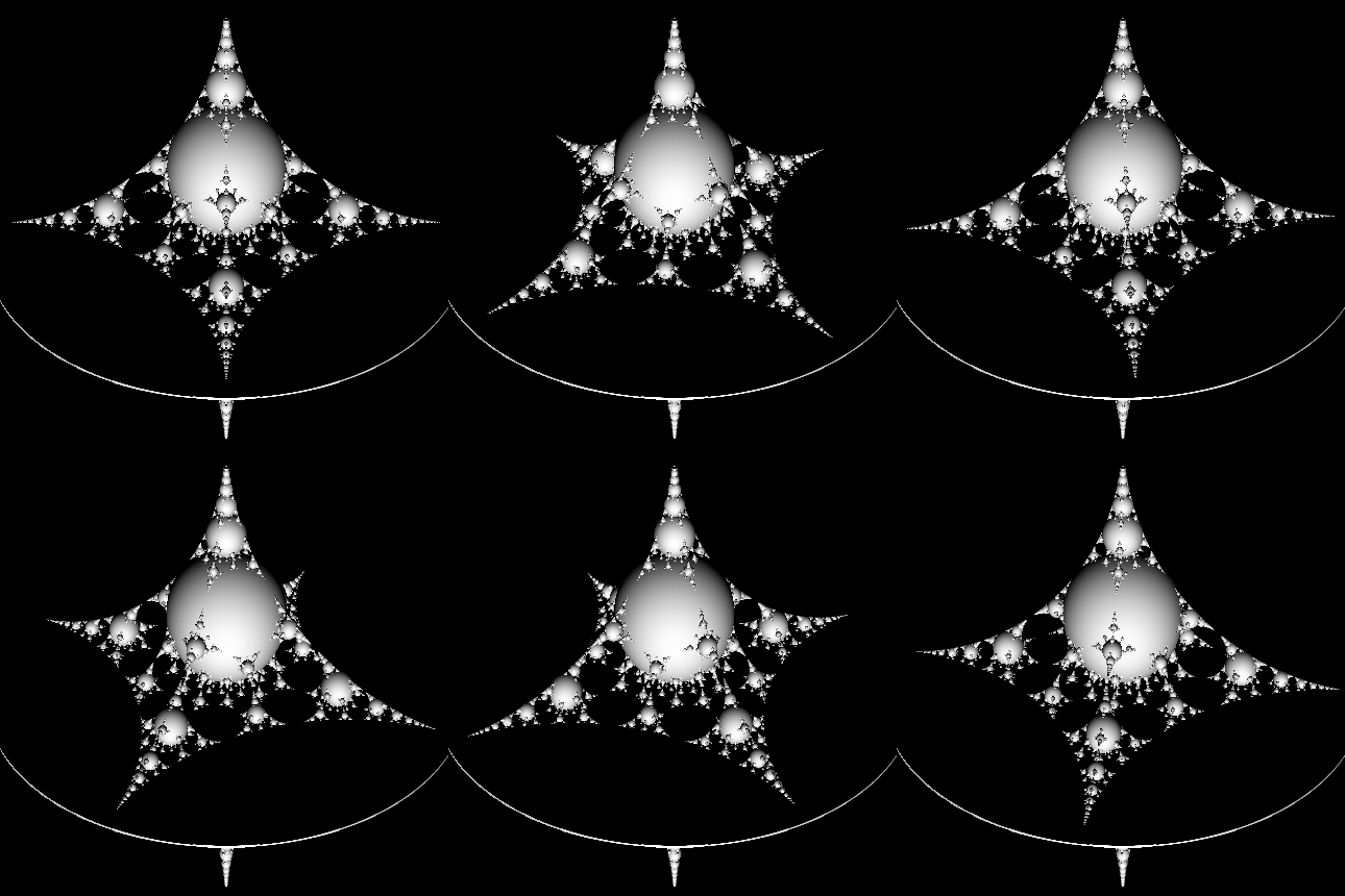
[Shadertoy] Basic Apollonian gasket that results in the image on the left. Please note that the fractal is mirrored across the X-axis here.

Using a very basic raymarching approach the fractal can be represented in 3D.

void mainImage( out vec4 fragColor, in vec2 fragCoord )
{
    vec2 uv = (2.0 * fragCoord - iResolution.xy) / iResolution.y;

    vec3 ro = vec3(0.0,  3.0, -5.0);
    vec3 rd = normalize(vec3(uv, 0.0) - ro);

    float dist = Raymarch(ro, rd);

    vec3 color = vec3(0.0);
    if (dist > 0.0)
    {       
        vec3 N = calcNormal(ro + dist * rd);
        vec3 L = vec3(0,0,-1);

        color = max(vec3(0), dot(N, L));
    }

    fragColor = vec4(color, 1);
}

[Shadertoy] Raymarching + surface normal calculation.

The final representation distorts the fractal to break the symmetries and make it look more organic. I got interesting results by offsetting the radius, in the case of “a disco for parasites”:

float sqrRadius = dot(p, p + sin(p.x * 0.3) + sin(p.z * 0.25) + sin(p.y * 0.14));

This resulted in a distorted 3D Apollonian gasket representation, and by experimentally rotating and offsetting the origin and direction vectors a photogenic view was found.

Texturing and lighting

Texturing proved to be more straightforward than expected. Commonly used strategies for texturing signed distance fields are triplanar mapping and cubemap lookups, however notwithstanding some stretching and mirroring artifacts it turned out that the components of vector p coud just be scaled and used for lookup in tiling 2D diffuse maps for a quite convincing result.

Physically based shading was used for lighting and the red component sampled from the diffuse map using the aforementioned texture coordinates was used for the roughness attribute of the material.

Literature:

Hill, Stephen., et al. (2013). Physically Based Shading in Theory and Practice. SIGGRAPH. [Available here]

Yáñez Escanciano, Jorge. (2017). An introduction to the limit set of Kleinian groups Master Thesis, Universidad Nacional de Educación a Distancia (España). Facultad de Ciencias [Available here]